Siyelu
 2026Siyelu
Step One: A Name That Means Everything
Siyelu comes from the Sinhala word for all, everything, the whole. As a designer, that’s both exciting and terrifying. How do you visually represent everything?
The first thing I learned was not to try. Instead of thinking of Siyelu as a name, I started treating it as a state: infinity, repetition, growth, and awareness. It isn’t something you explain. It’s something you sense.
Step Two: Collecting Infinite Things
I began sketching symbols that keep appearing across nature and philosophy, patterns that repeat endlessly and need no explanation:
- The all-seeing eye, for perception beyond the surface.
- Water ripples, the way water carries every disturbance outward.
- Spirals and Fibonacci growth, forms that expand without being told to.
- Branching systems, roots and trees, one origin with endless directions.
They were all beautiful, but together they were too much. A brand about everything still needed one place to begin.

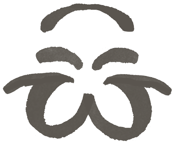

Step Three: Coming Home to සි
That place turned out to be very familiar. Every Sinhala-speaking child has practised the letter සි in a school copybook, carefully tracing its curves and the small loop above it.
That letter became the lens for everything else. Instead of treating it as typography, I treated it as form, a structure that could hold eyes, ripples, spirals, and growth while staying recognisably, quietly Sinhala.
Step Four: Five Ways of Seeing
From that one letter, five icon prototypes emerged:
- The first explores perception, combining the all-seeing eye, sun rays, and an abstracted S structure.
- The second is a direct, minimal version of සි that keeps it recognisable.
- The third and fifth isolate and mirror the ispilla, the upper stroke of සි, into symmetrical forms that suggest infinity and balance.
- The fourth reduces everything to the eye alone, a pure symbol of awareness.
Together they work less like separate logos and more like a visual language: different sentences in the same voice.


Step Five: A System That Keeps Growing
From the main icon, I built a modular icon system. Each secondary icon borrows the core mark’s geometry, rhythm, and proportions, so the system can grow in any direction without losing coherence.
It felt right for a brand named after everything. The identity behaves like the patterns that inspired it: it keeps expanding while staying recognisably itself.
Step Six: Social Media, Quietly
The social media system is built on restraint. The palette of muted neutrals, deep ink tones, softened naturals, and warm off-whites was chosen to last, not to follow trends, and to give the eye a rest instead of competing for attention.
Layouts use negative space and scale, letting the icon hold the weight while typography quietly supports it. The result is a feed that feels calm and well paced, not overcrowded or performative.


Step Seven: Stepping Into the Space
The Siyelu space carries the same thinking into the physical world. It’s circular, layered, and non-linear. Materials are organic, with textures that age well and surfaces that hold light softly. Spatial elements reflect the iconography through repetition, symmetry, and rhythm rather than literal symbols.
It’s designed less as a destination and more as a state of mind: grounded, inward-looking, and expansive without being overwhelming. Nothing demands attention, yet everything feels considered.
Step Eight: The Lesson
This project kept teaching me the same quiet lesson: good branding isn’t so much about invention as about attention.
Siyelu draws on ideas that already exist, like infinity, ripples, growth, and the act of seeing, and asks how little is needed to say something meaningful. Design often works best when it knows when to stop and leaves room for the viewer to complete the thought. ☀️